Tuesday, April 13, 2010

Historical Map


A Historical Map is a map that shows places and events of the past. Our Historical Map has color-coordinated data classes that plot the location of old monastaries and provinces in Ireland in the year of 650 AD.

This image was taken from: http://www.google.com/imgres?imgurl=http://www.wesleyjohnston.com/users/ireland/maps/historical/map650.gif&imgrefurl=http://www.wesleyjohnston.com/users/ireland/map_index.html&usg=__TkmzJu6IjM5KWJvpV9atJyX2MKI=&h=599&w=452&sz=20&hl=en&start=1&um=1&itbs=1&tbnid=lVSh9ExXnjznyM:&tbnh=135&tbnw=102&prev=/images%3Fq%3Dhistorical%2Bmap%26um%3D1%26hl%3Den%26sa%3DG%26tbs%3Disch:1
Star Plots


The star plot is a graphical technique for displaying and analyzing the behavior of multivariate data for a single observation. Each star plot has an irregular polygon shape and equal distance radii representing different variables within a data set. Our star plot is created in a multi-plot format and examines the crime rate for each U.S. city listed.

This image was taken from: http://images.google.com/imgres?imgurl=http://www.math.yorku.ca/SCS/Gallery/images/starcrim2.gif&imgrefurl=http://www.math.yorku.ca/SCS/Gallery/milestone/sec8.html&usg=__f5iJmaFMjSPZ2aUhvJIMQp-hgy4=&h=505&w=504&sz=9&hl=en&start=3&itbs=1&tbnid=HjdhiticvsQY5M:&tbnh=130&tbnw=130&prev=/images%3Fq%3DStar%2Bplots%26hl%3Den%26sa%3DG%26gbv%3D2%26tbs%3Disch:1

Correlation Matrix


A Correlation Matrix is a type of matrix that establishes a relationship between two or more variables. This type of Matrix has data variable names that are listed across its top row and along its first column and a diagonal always consisting of ones that goes from its upper left corner to its lower right corner. Our correlation matrix shows the relationship between the “ top 100 cancer genes,” and it has a red diagonal running from its left to right corner that consist of one values.

Image taken from: http://images.google.com/imgres?imgurl=http://www.livestockgenomics.csiro.au/Genome_to_Phenome/matrix32_blocked.png&imgrefurl=http://www.livestockgenomics.csiro.au/Genome_to_Phenome/&usg=__Yfd_2_IeD8SayFb7gH7f48l9Nl4=&h=597&w=622&sz=82&hl=en&start=2&itbs=1&tbnid=5QQiOkveFfGYEM:&tbnh=131&tbnw=136&prev=/images%3Fq%3DCorrelation%2Bmatrix%26hl%3Den%26sa%3DG%26gbv%3D2%26tbs%3Disch:1

Similarity Matrix


A Similarity Matrix is a matrix of scores which shows the similarity between two data values. This matrix compares and contrasts different signatures. While the white spaces represent signatures with insignificant commonalities,the deeper red hues represent those with greater similarity.

This image was taken from: http://images.google.com/imgres?imgurl=http://www.biomedcentral.com/content/figures/1471-2164-8-353-5-l.jpg&imgrefurl=http://www.biomedcentral.com/1471-2164/8/353/figure/F5%3Fhighres%3Dy&usg=__y--fGT8xJ6AC0J834O0RFFyUzm8=&h=1200&w=1200&sz=326&hl=en&start=3&itbs=1&tbnid=2YCExa9VRj-1LM:&tbnh=150&tbnw=150&prev=/images%3Fq%3DSimilarity%2Bmatrix%26hl%3Den%26sa%3DG%26gbv%3D2%26tbs%3Disch:1

Steam and Leaf Plot


A Stem-and-Leaf plot is a graphical display that organizes numerical data in order of place value and assigns it to a category of either a "steam" or "leaf." In this type of map, the data values from the stem and leaf categories combine to form a numeric group. In this Stem-Leaf-plot of student science scores, the highest test score is a 97/A and lowest is a 56/F.

This image was taken from: http://images.google.com/imgres?imgurl=http://www.mrnussbaum.com/gamesimages/plot1.gif&imgrefurl=http://www.mrnussbaum.com/graphg5.htm&usg=__K2Cb2jHBxYbIrM6nsjrO-EbgDXg=&h=300&w=400&sz=8&hl=en&start=15&itbs=1&tbnid=JBxpnk0FuKO5JM:&tbnh=93&tbnw=124&prev=/images%3Fq%3Dsteam%2Band%2Bleaf%2Bplot%26hl%3Den%26gbv%3D2%26tbs%3Disch:1

Box Plot


A Box Plot is a graphical display of a set of arithmetic data in terms of its five number summaries: sample minimium, lower quartile, median, upper quartile, and sample maximum. The above Box plot has lines at its lower, median, and upper quartile values and "whiskers" that extend from each end of it to a selected value. This image is a Box plot of car mileage for a series of nations and it shows that the U.S.A has the greatest mileage distribution.

Image taken from: http://images.google.com/imgres?imgurl=http://www.kxcad.net/cae_MATLAB/toolbox/stats/boxplot1.gif&imgrefurl=http://www.kxcad.net/cae_MATLAB/toolbox/stats/boxplot.html&usg=__LPjbYE7A_ThJ3Jm8GD6i4pMlVO0=&h=354&w=476&sz=6&hl=en&start=9&itbs=1&tbnid=Xjjp1ZZ5MLcQIM:&tbnh=96&tbnw=129&prev=/images%3Fq%3DBox%2BPlot%26hl%3Den%26sa%3DG%26gbv%3D2%26tbs%3Disch:1

Monday, April 12, 2010

Histogram


A Histogram is a graphical reprsentation that shows the distribution of data classes or " bins" that fall into a various ranges. This Histogram has five colorful rectangular bins that establish a relationship between a "number of students" and "exam scores." It shows how histograms are represented by adjacent rectangles that fill at intervals directly proportional to the frequency of its bins.

This image was taken from: http://images.google.com/imgres?imgurl=http://media.techtarget.com/digitalguide/images/Misc/iw_histogram.gif&imgrefurl=http://searchsoftwarequality.techtarget.com/sDefinition/0,,sid92_gci330729,00.html&usg=__HB7NfRUGpMOcx3Im2_IYTnlDosg=&h=408&w=350&sz=7&hl=en&start=1&itbs=1&tbnid=UoEt8mY1OqYi4M:&tbnh=125&tbnw=107&prev=/images%3Fq%3Dhistogram%26hl%3Den%26gbv%3D2%26tbs%3Disch:1

Parallel Coordinate Graph


A Parallel coordinate graph is a visual and geometric tool that examines data from two or more variables simultaneously. This type of graph is great for comparing and contrasting multivariate data. This Parallel coordinate graph has several categories that show how different cars stack up against each other in terms of price, quality and performance.

Image taken from: http://images.google.com/images?hl=en&source=hp&q=Parallel+coordinate+graph&btnG=Search+Images&gbv=2&aq=f&aqi=&aql=&oq=&gs_rfai=

Triangular plot


A Triangular plot is a graphic illustration that shows the ratios of the three variables as positions in an equilateral triangle that add up to a constant.This ternary plot uses colors to show which voting conditions would project a favorable outcome for the three dominant political parties. According to the graph, party representatives will need at least 51 percent of the electoral vote to win.

Image taken from: http://images.google.com/imgres?imgurl=http://www.ex-parrot.com/~chris/images/20050407/triangle.png&imgrefurl=http://www.ex-parrot.com/~chris/wwwitter/20050407-it_doesnt_matter_how_you_vote_either_way_your_planet_is_doomed.html&usg=__WVwlZOPWX7LemGrend2wqYnvJiU=&h=362&w=382&sz=29&hl=en&start=1&um=1&itbs=1&tbnid=4NVWFUzWJ_Tc4M:&tbnh=117&tbnw=123&prev=/images%3Fq%3DTriangular%2Bplot%26um%3D1%26hl%3Den%26sa%3DG%26tbs%3Disch:1

Sunday, April 11, 2010

Windrose

A Windrose is a map diagram that is used to determine the air pressure velocity distribution for specific area. It is commonly used by meterologist to show wind frequency and strength. This Windrose has color-coded bands that are divided into increments of two to show wind speed ranges and seven circular lines that represent different frequencies.

Climograph

This image is a Climograph which is a graphical representation of the monthly precipitation and temperature conditions for a selected place. The monthly precipitation is shown by a purple bar graph, while an overlapping a blue line graph depicts temperature. Judging from this map, Colorado gets the highest level of precipitation during its summer months of June and July.

This image was taken from: http://images.google.com/imgres?imgurl=http://www.colorado.edu/geography/extra/geogweb/manitousprings/gif/climograph.gif&imgrefurl=http://www.colorado.edu/geography/extra/geogweb/manitousprings/intro/page2.html&usg=__GqcP8jKB_LI_3FKkvQtJhinvleU=&h=333&w=487&sz=6&hl=en&start=17&um=1&itbs=1&tbnid=ncnV3s7zUaXWQM:&tbnh=88&tbnw=129&prev=/images%3Fq%3DClimograph%26um%3D1%26hl%3Den%26sa%3DG%26tbs%3Disch:1

Population profile.

This image is a population profile of both male and females in Mobile County, Alabama. A population profile a graphical represention showing an amount people in relationship to their ages. This graph projects the "ages" stages of four along the vertical axis of the cartesian plane, and the "population percentage" in stages 2 along the horizonatal axis of this plane.

This image was taken from: http://images.google.com/imgres?imgurl=http://camellia.shc.edu/literacy/tablesversion/assignments/Image2.jpg&imgrefurl=http://camellia.shc.edu/literacy/tablesversion/assignments/statisticsassign.htm&usg=__UQPIlMRDWuMw1D6CYwA93DsfEs4=&h=1568&w=1191&sz=169&hl=en&start=2&um=1&itbs=1&tbnid=x09kvrrl1LjMrM:&tbnh=150&tbnw=114&prev=/images%3Fq%3Dpopulation%2Bprofile%26um%3D1%26hl%3Den%26sa%3DG%26tbs%3Disch:1

Scatterplot


This is Scatterplot graph showing a positive correlation between "income" and "years of experience" as noted by the rising curve. A Scatterplot is a type of mathematical representation that establishes a relationship between a two variables on an coordinate axis. The variable on the verticle axis represents income, while the variable on the horizontal axis represents years of experience.

This image was taken from: http://images.google.com/imgres?imgurl=http://allpsych.com/researchmethods/images/scatterplot.gif&imgrefurl=http://allpsych.com/researchmethods/correlation.html&usg=__64JW8AFAAq0MawRVtkYcYtDRDH8=&h=270&w=354&sz=5&hl=en&start=10&itbs=1&tbnid=mnmE3CT_h1u8AM:&tbnh=92&tbnw=121&prev=/images%3Fq%3Dscatter%2Bplot%26hl%3Den%26sa%3DX%26gbv%3D2%26tbs%3Disch:1

Index Value Plot


This image is Index value plot that shows the variations in an agricultural region in Australia through a form of remote sensing technology. An Index value plot shows a proportionalty distribution between a variable and a point of reference on a coordinate axis. This graphic represenation shows an inequality with the year on the horizontal axis, the index value on the verticle axis, and the results are plotted on the graph.

This image was taken from: http://images.google.com/imgres?imgurl=http://www.cmis.csiro.au/rsm/research/remveg/FIG9.jpg&imgrefurl=http://www.cmis.csiro.au/rsm/research/remveg/vegassess_all.html&usg=__9SkztZnXp2MnyIQkcwLwDBxBnTE=&h=512&w=512&sz=27&hl=en&start=18&itbs=1&tbnid=ODEYYzQYlBCBWM:&tbnh=131&tbnw=131&prev=/images%3Fq%3DIndex%2BValue%2B%2BPlot%26hl%3Den%26sa%3DG%26gbv%3D2%26tbs%3Disch:1

Lorenz Curve


This image is a Lorenz Curve which is a graphical representation of the proportionality of a distribution. It is often associated with income distribution calculations and the analysis of inequality. It establishes a statistical relationship between households(plotted on the X axis) and income (plotted on the Y axis).

This image was taken from: http://images.google.com/imgres?imgurl=http://www.knowledgerush.com/wiki_image/b/bd/Lorenz-curve1.png&imgrefurl=http://www.knowledgerush.com/kr/encyclopedia/Lorenz_curve/&usg=__y5lSWspMSFqfdfk0VfUnM8annmc=&h=346&w=609&sz=3&hl=en&start=7&itbs=1&tbnid=rWP2e0IT-pvikM:&tbnh=77&tbnw=136&prev=/images%3Fq%3DLorenz%2Bgraph%26hl%3Den%26sa%3DX%26gbv%3D2%26tbs%3Disch:1

Saturday, April 10, 2010

Bilateral graph


This image is a Bilateral graph examining China's approval rating in terms of its governing body. Bilateral graphs are graphic, visual tools that compare variables with both negative and positive values. This particular image uses multiple horizontal bar graphs to compare the Asian and African people's reponses to this poll.

Ths Image was taken from: http://images.google.com/imgres?imgurl=http://media.gallup.com/poll/graphs/080429China2Graph2_GASJIDHUQfredo.gif&imgrefurl=http://www.gallup.com/poll/106858/chinas-leadership-better-regarded-outside-west.aspx&usg=__PFTPmfHlK_Y-eBp5GrLDKQkDXOk=&h=345&w=507&sz=13&hl=en&start=3&itbs=1&tbnid=36LAwzrYnFS47M:&tbnh=89&tbnw=131&prev=/images%3Fq%3Dbilateral%2Bgraph%26hl%3Den%26sa%3DG%26gbv%3D2%26tbs%3Disch:1

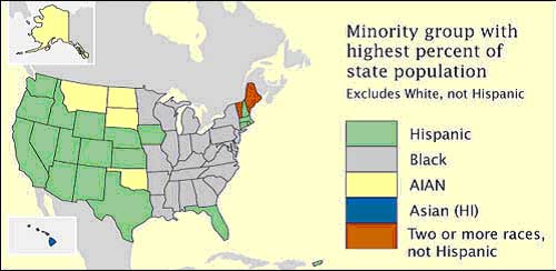
Nominal Area Choropleth Map


This image is Nominal Area Choropleth Map showing the dominant "minority group" in each state in the U.S.A. This type of map uses Nominal data which is categorical and classifiable into groups, but does not require a specific arrangement. This particular Nominal Area Choropleth Map defines the variables in terms of their racial classifications without adherence to any implicit order.

Ths image was taken from: http://images.google.com/imgres?imgurl=https://courseware.e-education.psu.edu/courses/geog482/graphics/citationexample.jpg&imgrefurl=http://www.e-education.psu.edu/courses/geog482/policies.shtml&usg=__4wFmRq3qXnn4g8ttm_uIuLrrAgA=&h=244&w=500&sz=19&hl=en&start=1&itbs=1&tbnid=gmPe-PnM38B7lM:&tbnh=63&tbnw=130&prev=/images%3Fq%3DNominal%2Barea%2Bchoropleth%2Bmap%26hl%3Den%26sa%3DX%26gbv%3D2%26tbs%3Disch:1

Standardized choropleth maps


This image is a Standardized choropleth map of Canada that shows the amount of children 14 years of age and younger. In this type of map, the data is divided typically in terms of land area or a related variable to allow comparison of the phenomenom. This image uses the shade and lightness of a green hue in direct relationship to a numeric value to graphically ilustrate the data.

This image was taken from: http://images.google.com/imgres?imgurl=http://www.statcan.gc.ca/pub/92f0138m/2008003/figures/figure3.1-en.jpg&imgrefurl=http://www.statcan.gc.ca/pub/92f0138m/2008003/figures/5200001-eng.htm&usg=__LwfMIXP6xqMcKs73DRmozwwQX3g=&h=620&w=850&sz=318&hl=en&start=1&itbs=1&tbnid=CVFlvJdZBdf_YM:&tbnh=106&tbnw=145&prev=/images%3Fq%3DStandardized%2Bchoropleth%2Bmaps%26hl%3Den%26sa%3DG%26gbv%3D2%26tbs%3Disch:1

Univariate choropleth maps


This image is Univariate Choropleth map of the percentage of poor people in the United States. Univariate Choropleth Maps,unlike Bivariate choropleth maps, show a single data variable on the map. The numerical value of its data is directly proportional to the shadings of its continuous color scale, in this case the color scheme is brown.

This Image was taken from: http://images.google.com/imgres?imgurl=http://www.cdc.gov/pcd/issues/2007/oct/images/07_0091_01.gif&imgrefurl=http://www.cdc.gov/pcd/issues/2007/oct/07_0091.htm&usg=__k4kqV3NzNI8cXuyYoavBItSp1io=&h=330&w=450&sz=42&hl=en&start=13&itbs=1&tbnid=zDSsK9QPFFehRM:&tbnh=93&tbnw=127&prev=/images%3Fq%3DUnivariate%2Bchoropleth%2Bmaps%26hl%3Den%26sa%3DG%26gbv%3D2%26tbs%3Disch:1

Bivariate Choropleth Map


This image is a Bivariate Choropleth Map of the " Median House Value and 1997 population for counties in Ohio." Bivarate Choropleth Map display two variables on a single map by combining two different sets of graphic symbols. This map graphically illustrates the relationship between two different variables, in this case population density and house value.

This Image was taken from: http://images.google.com/imgres?imgurl=http://proceedings.esri.com/library/userconf/proc99/proceed/papers/pap171/p1715.jpg&imgrefurl=http://proceedings.esri.com/library/userconf/proc99/proceed/papers/pap171/p171.htm&usg=__gAHvqDXCaMoQjdlIx2WtQti2urM=&h=367&w=638&sz=66&hl=en&start=17&itbs=1&tbnid=FLedHGD0xHssJM:&tbnh=79&tbnw=137&prev=/images%3Fq%3DBivariate%2Bchoropleth%2Bmaps%26hl%3Den%26sa%3DG%26gbv%3D2%26tbs%3Disch:1

Friday, April 9, 2010

Unclassified Chloropleth Map


This image is a Unclassified Chloropleth Map of the birth rate of children to women in some European Nations. In Unclassified Chloropleth Maps shading and tinting of a continous color is used to designate a numerical value. In this particular map a continous orange scale is used to denote the maxium and minimum fertility rate of children in Europe.

This Image was taken from:
http://images.google.com/imgres?imgurl=http://www.esds.ac.uk/international/images/uchoropleth.gif&imgrefurl=http://www.esds.ac.uk/international/support/user_guides/gisoverview.asp&usg=__wM_v7xf-Brm4zbymwKkZwfnGQXI=&h=289&w=454&sz=45&hl=en&start=1&itbs=1&tbnid=O9dCkATpsA3MoM:&tbnh=81&tbnw=128&prev=/images%3Fq%3Dunclassed%2Bchoropleth%2Bmap%26hl%3Den%26sa%3DG%26gbv%3D2%26tbs%3Disch:1

Classed Choropleth Map


This image is a Classed Choropleth Map that shows the number of males per 100 females for a Census for the year 2000. Classed Choropleth Maps combine areal units into smaller groups that are divided into intervals using the process of Equal Steps, Quantiles, Natural Breaks or Minimum Variance. This map employs six different Data classes that use equal aerial units and a graded color series to show intensity.

This Image was taken from: http://images.google.com/imgres?imgurl=http://www.ilstu.edu/~jrcarter/Geo204/Choro/map-AmFact-6eqint-orange-80pct.jpg&imgrefurl=http://jsellers-maps.blogspot.com/2008_10_01_archive.html&usg=__eqy-oLjvwO3_J20YTAwijdEVL6I=&h=313&w=520&sz=59&hl=en&start=6&itbs=1&tbnid=NEjVgi73UL2egM:&tbnh=79&tbnw=131&prev=/images%3Fq%3Dclassed%2Bchoropleth%2Bmap%26hl%3Den%26gbv%3D2%26tbs%3Disch:1

DLG


This image is a DLG (Digital Line Gragh) of the United States. DLG data shows digital representations of cartographic information. The high resolution colors on this map represent different states,counties,roadways,water bodies and other geographic data and locations.

This Image was taken from: http://images.google.com/imgres?imgurl=http://weather.unisys.com/usgs/3sec/usgs-US.gif&imgrefurl=http://weather.unisys.com/usgs/3sec/index.html&usg=__ftn7uaf1Tfb2nTwO8LgF8GcIEMM=&h=444&w=742&sz=143&hl=en&start=3&itbs=1&tbnid=wPpf7otFPqUr9M:&tbnh=84&tbnw=141&prev=/images%3Fq%3DDLG%2BMAP%26hl%3Den%26sa%3DG%26gbv%3D2%26tbs%3Disch:1

DEM


This image is a DEM ( Digital Elevation Model) of the Sacramento Valley located in nothern California. A DEM is a digital representation of ground surface topography and are usually obtained by remote sensing than direct survey. This map has a color coordinated chart that shows the ranges in elevation for its various geographic features in meters.

This Image was taken from: http://images.google.com/imgres?imgurl=http://www.emporia.edu/earthsci/student/alvarez1/svdem.jpg&imgrefurl=http://www.emporia.edu/earthsci/student/alvarez1/551proj.html&usg=__zU4CgN1HtOSnfArHupBJjnm23fM=&h=723&w=671&sz=184&hl=en&start=15&itbs=1&tbnid=J7T6FIXT9fusiM:&tbnh=140&tbnw=130&prev=/images%3Fq%3DDem%2Bmap%26hl%3Den%26sa%3DG%26gbv%3D2%26tbs%3Disch:1

DOQQ


This image is DOQQ(Digital Orthophoto Quadrangle) of "Coastal Lousiana." DOQQ uses georectified raster image developed from aerial photos. This image of Lousiana uses false color- infrared photography rather than true color to better define its surface features.

This image was taken from: http://images.google.com/imgres?imgurl=http://www.lacoast.gov/maps/2005doqq/la_doqq.gif&imgrefurl=http://www.lacoast.gov/maps/2005doqq/&usg=__pKg6dWlKXKRgs41D-jmDVPOq7Ts=&h=451&w=584&sz=84&hl=en&start=15&itbs=1&tbnid=vombHZLNLGeaPM:&tbnh=104&tbnw=135&prev=/images%3Fq%3Ddoqq%26hl%3Den%26sa%3DG%26gbv%3D2%26tbs%3Disch:1

DRG


This image is a DRG (Digital Raster Graphics) of a region of the state of Texas. DRGs are USGS Topographic Maps and their images are taken from the U.S. Geological Survey. DRG is georeferenced to surface of the earth which means it contains geographic coordinates or UTM.

This Image was taken from:
http://images.google.com/imgres?imgurl=http://www.tceq.state.tx.us/assets/public/gis/images/drg.gif&imgrefurl=http://www.tceq.state.tx.us/gis/drg.html&usg=__qxjL45cP4iIaG2I7U_tRa1wO3Vs=&h=556&w=607&sz=97&hl=en&start=2&itbs=1&tbnid=XTr5fV2kfCeExM:&tbnh=125&tbnw=136&prev=/images%3Fq%3DDRG%26hl%3Den%26sa%3DG%26gbv%3D2%26tbs%3Disch:1

Thursday, April 8, 2010

Isotach Map


Isopleth Map


This image is an Isopleth map of California's H1N1 deaths for Nov. 10, 2009. An Isopleth Map simplifies data about a specific region by showing areas with continous distribution. This map uses a color chart and contour lines to define the areas in California that were affected by H1N1 deaths for this date and time.

This Image was taken from: http://images.google.com/imgres?imgurl=http://www.flutrackers.com/forum/attachment.php%3Fattachmentid%3D4969%26d%3D1257917452&imgrefurl=http://www.flutrackers.com/forum/showthread.php%3Ft%3D132504&usg=__2ww6CtUax11g3mPEj7WQH2AR-ns=&h=674&w=826&sz=111&hl=en&start=31&itbs=1&tbnid=_2PI-jmTmgWVDM:&tbnh=118&tbnw=144&prev=/images%3Fq%3DIsopleth%2Bmap%26start%3D18%26hl%3Den%26sa%3DN%26gbv%3D2%26ndsp%3D18%26tbs%3Disch:1

Isohyet


This image is a Isohyet Map of Guinea Coast, West Africa. Isohyet maps show rainfall distribution for a mapping region. This map uses a color coordinated chart to show the average yearly rainfall distribution in inches for this part of African continent.

This image was taken from: http://images.google.com/imgres?imgurl=http://media-2.web.britannica.com/eb-media/43/5043-004-632D4EC3.gif&imgrefurl=http://www.britannica.com/EBchecked/topic-art/474379/100063/Distribution-of-peoples-and-annual-rainfall-in-the-Guinea-Coast&usg=__U-LhafogGhw3MC9By43_firBWhE=&h=308&w=630&sz=20&hl=en&start=24&itbs=1&tbnid=yr6ccmwZX3JkpM:&tbnh=67&tbnw=137&prev=/images%3Fq%3Disohyet%2Bmap%26start%3D18%26hl%3Den%26sa%3DN%26gbv%3D2%26ndsp%3D18%26tbs%3Disch:1

Isopach


This image is a Isopach Map of the Sussex "B" Sandstone. An Isopach map is a map illustrating variation of rock or sediment thickness. This map has Isopach lines (contour intervals = 4ft. ) that depict the thickness of a rock layer known to produce oil at a contour interval of 40,000 barrels.

This Image was taken from: http://images.google.com/imgres?imgurl=http://pubs.usgs.gov/dds/dds-033/USGS_3D/ssx_gif/ssxiso.gif&imgrefurl=http://pubs.usgs.gov/dds/dds-033/USGS_3D/ssx_txt/all.htm&usg=__blEnvyVJe0AqykvjshFm-xSDVh0=&h=603&w=924&sz=39&hl=en&start=14&itbs=1&tbnid=mwavILFW06FX0M:&tbnh=96&tbnw=147&prev=/images%3Fq%3Disopach%2Bmap%26hl%3Den%26gbv%3D2%26tbs%3Disch:1

Doppler Radar


This is a Doppler Radar Map measuring the range and intesity of Hurrican Frances' movement through Florida in 2004. Doppler Radar uses an antena to measure the time and arrival of reflected pulses from distant objects. This measurement is called DBZ (decibels of Z). The scale of DBZ values can be seen at the side of this image and are reflected on the map with the most intense areas of this storm shown in orange and red hues.

This image was taken from:
http://images.google.com/imgres?imgurl=http://www.weatherusa.net/blog/images/doppler-orlando-1943.gif&imgrefurl=http://www.weatherusa.net/blog/entry.php%3Fid%3D3&usg=__-NUqtz1shxwzixXfj-M8ey28U4M=&h=620&w=620&sz=51&hl=en&start=3&itbs=1&tbnid=-lqo28ggXCXHhM:&tbnh=136&tbnw=136&prev=/images%3Fq%3DDoppler%2Bradar%26hl%3Den%26gbv%3D2%26tbs%3Disch:1

Dot Distribution Map


This image is a Dot distribution map of western and nothern England and Scotland. Dot distribution maps portray quantitative data as a dot which represents a percentage of the phenomenon found within the boundary of a geographic location. This map uses diffent sized dots to show the Provisional distribution of Wheatear bird in the 2008 breedng season for these parts of England and Scotland.

This image was taken from: http://images.google.com/imgres?imgurl=http://www.birdguides.com/i/articles/001596/wheatear.jpg&imgrefurl=http://www.birdguides.com/webzine/article.asp%3Fa%3D1596&usg=__EdVb8tMdw7ULlBTtODWpIDjNZSA=&h=681&w=480&sz=33&hl=en&start=10&itbs=1&tbnid=j_wbreXpzVG96M:&tbnh=139&tbnw=98&prev=/images%3Fq%3Ddot%2Bdistribution%2Bmap%26hl%3Den%26gbv%3D2%26tbs%3Disch:1

Infrared Aerial Photo


This image is a Colored Infrared Aerial Photo of a football staduim and its surrounding scenery, which includes Pine trees, buildings, and other vegetation. Infrared Aerial Photography is a type of remote sensing technology which can measure or observe objects without coming into direct contact with them. As we see in this image, land contrast is very pronounced in IR aerial photos. We can see Pine trees and other vegetation reflected in red.

This image was taken from: http://images.google.com/imgres?imgurl=http://www.geology.iupui.edu/Academics/CLASSES/G303/Image_Interp/images/infrared.jpg&imgrefurl=http://www.geology.iupui.edu/Academics/CLASSES/G303/Image_Interp/remote_sensing.htm&usg=__PGFHtUhON7gDmTcmYKILAR3CqiU=&h=742&w=1200&sz=775&hl=en&start=19&itbs=1&tbnid=vkgozlbJi-VKqM:&tbnh=93&tbnw=150&prev=/images%3Fq%3DInfrared%2BAerial%2BPhoto%26start%3D18%26hl%3Den%26sa%3DN%26gbv%3D2%26ndsp%3D18%26tbs%3Disch:1

Black & White Aerial Photo


This image is a Black & White Aerial Photo of "Downtown Johnstown," a city that was rebuild several times after constant flooding activity. Black & White Aerial Photography is another type of remote sensing technology and it is sensitive to approximately the same wavelengths as the human eye. This image is a 1950s depiction of the this town and quite visible are the buildings,roadways,and vegetation that it consist of.

This image was taken fom: http://images.google.com/imgres?imgurl=http://www.jaha.org/edu/flood/rebuild/img/panoramas/550w/JT_aerial-1950s-550.jpg&imgrefurl=http://www.jaha.org/edu/flood/rebuild/img/panoramas/index.html&usg=__6C_nX6ySXwk_YktKx5xAzptsK-M=&h=449&w=550&sz=129&hl=en&start=6&itbs=1&tbnid=--7gtI6wmRwN9M:&tbnh=109&tbnw=133&prev=/images%3Fq%3DBlack%2Band%2Bwhite%2Baerial%2Bphoto%26hl%3Den%26sa%3DG%26gbv%3D2%26tbs%3Disch:

LIDAR


This is a LIDAR Image of "The World Trade Center" in Manhattan, New York. This 3D image was created following the September 11, 2002 terrorist attacks on this city and was used for research and as part of the recovery effort. LIDAR (Light Detection And Ranging) is an optical remote sensing technology that uses lasar instead of radio or microwave radiation to detect light particles.

This Image was taken from: http://images.google.com/imgres?imgurl=http://www.noaanews.noaa.gov/stories/images/manhattan-lidar092701.jpg&imgrefurl=http://www.noaanews.noaa.gov/stories/s798.htm&usg=__qPas5ew9n62BjZBmwMxSJBkahow=&h=2056&w=3764&sz=1706&hl=en&start=4&itbs=1&tbnid=piJMuN9X0xzn0M:&tbnh=82&tbnw=150&prev=/images%3Fq%3DLIDAR%26hl%3Den%26sa%3DG%26gbv%3D2%26ndsp%3D18%26tbs%3Disch:1

Isobars


This image is a Isobararic Map of the United States. This Isobaric map has Isobars (yellow solid lines) that show air pressure variation. Isobars are similar to contour lines, in that the closer in proximity that they are to each other the greater the wind pressure.

This Image was taken from: http://images.google.com/imgres?imgurl=http://www.solcomhouse.com/images/isobar.gif&imgrefurl=http://www.solcomhouse.com/windpower.htm&usg=__GMFCNznUDX7ICEmR-scnyUi_8ps=&h=768&w=1024&sz=228&hl=en&start=12&itbs=1&tbnid=aJWm3wdwSLmAgM:&tbnh=113&tbnw=150&prev=/images%3Fq%3Disobar%26hl%3Den%26sa%3DG%26gbv%3D2%26ndsp%3D18%26tbs%3Disch:1

Cartogram


This image is a Cartogram Map of the projected state wins for the 2008 Presidential electorial vote. A Cartogram is a map in which some thematic mapping variable is substituted for land area. This map highlights whether or not the Democratic Presidential Nominee (Obama) or the Republican Nominee (McCain) is projected to win based on the popular vote.

This Image was taken from: http://images.google.com/imgres?imgurl=http://upload.wikimedia.org/wikipedia/commons/2/22/Cartogram-2008_Electoral_Vote.gif&imgrefurl=http://commons.wikimedia.org/wiki/Category:Cartograms&usg=__9LV0wF1ZOnp49gbeDN6pJDVOppA=&h=850&w=1000&sz=49&hl=en&start=28&itbs=1&tbnid=iTPkZ4hQQPWk8M:&tbnh=127&tbnw=149&prev=/images%3Fq%3Dcartogram%2Bmap%26start%3D18%26hl%3Den%26sa%3DN%26gbv%3D2%26ndsp%3D18%26tbs%3Disch:1

Isoline Map


This image is a Isoline Map of the "Kopplin Uranium Mine" located in the Nueces River watershed in Live Oak County, Texas. An isoline map is a map with continuous lines joining points of the same value. This map was created as part of a radiation contamination survey and it uses continous contours lines to outline the main geographic features of this map.

This Image was taken from: http://images.google.com/imgres?imgurl=http://proceedings.esri.com/library/userconf/proc02/pap0167/p01674.jpg&imgrefurl=http://proceedings.esri.com/library/userconf/proc02/pap0167/p0167.htm&usg=__U35OPOebsG56q22Ylj0Pm2pqqC0=&h=547&w=707&sz=143&hl=en&start=17&itbs=1&tbnid=XP-SAcKk-6v28M:&tbnh=108&tbnw=140&prev=/images%3Fq%3Disoline%2Bmap%26hl%3Den%26sa%3DG%26gbv%3D2%26tbs%3Disch:1

Proportional Circle Map


This image is a Proportional Circle Map of the Mexican Population within the United States for the year 1990. Proportional Circle Maps show data in relationship to various circle sizes. This particular map establishes a relationship between increasing circle sizes and increaing population density for Mexicans per U.S. state.

This Image was taken fom: http://images.google.com/imgres?imgurl=http://www.neiu.edu/~jrthomas/377/circle.jpg&imgrefurl=http://www.neiu.edu/~ejhowens/377/examples.htm&usg=__74j5gvuGOBKd2EeZDxUWa-X0O54=&h=584&w=678&sz=118&hl=en&start=3&itbs=1&tbnid=-Wjkl8dbn8ZEYM:&tbnh=120&tbnw=139&prev=/images%3Fq%3Dproportional%2Bcircle%2Bmap%26hl%3Den%26sa%3DG%26gbv%3D2%26tbs%3Disch:1

PLSS Map


This image is a PLSS map of the United States of America. PLSS is a way of subdividing and describing public domain lands owned by the Federal government in the United States. This map shows the principal meridans and baselines used for surveying states in the United States.

This Image was taken from: http://images.google.com/imgres?imgurl=http://gis.nwcg.gov/giss_2006/job_aids/maps_and_graphics/USA_PLSS_Meridians_map.jpg&imgrefurl=http://gis.nwcg.gov/giss_2006/cd_contents.html&usg=__6fwSrzU16-Z48U9DJZUVEjApsv8=&h=1095&w=1595&sz=812&hl=en&start=3&itbs=1&tbnid=kcYAKM5FpuL4SM:&tbnh=103&tbnw=150&prev=/images%3Fq%3DPLSS%2BMAP%26hl%3Den%26sa%3DG%26gbv%3D2%26tbs%3Disch:1

Hyposometric Map


This image is a Hyposometric Map of the federal, provincial and territorial boundaries and capitals for Canada. Hyposometic maps utilize various shades and tints to show surface elevation and relief. This image has a color chart that is coordinated to the map that indicates ocean floor levels in meters for Canada.

This image was taken from: http://images.google.com/imgres?imgurl=http://www.trailcanada.com/images-maps/canada-map-relief.jpg&imgrefurl=http://www.trailcanada.com/canada/map/relief/&usg=__fkGOuoN5-qiWeTDBs-mVT6yglZY=&h=433&w=550&sz=81&hl=en&start=12&itbs=1&tbnid=pTNEIjcyfLKrkM:&tbnh=105&tbnw=133&prev=/images%3Fq%3Dhypsometric%2Bmap%26hl%3Den%26sa%3DG%26gbv%3D2%26tbs%3Disch:1

Topographic Map


This is a Topographic map of the "La Maliche" volcano that is located in South Central Mexico. This map uses contour lines to show the shape and elevation of the Volcano. This map captures the natural, graphic, and three -dimensional aspect of the volcano on two- dimensional space.

This image was taken from: http://images.google.com/imgres?imgurl=http://www.skimountaineer.com/ROF/NorAm/Malinche/MalincheMap.jpg&imgrefurl=http://www.skimountaineer.com/ROF/ROF.php%3Fname%3DMalinche&usg=__2bRKH79PTfXUXI0j35V8ELmR_Ic=&h=800&w=1000&sz=199&hl=en&start=1&itbs=1&tbnid=es1zjUGvBbVMWM:&tbnh=119&tbnw=149&prev=/images%3Fq%3Dtopographic%2Bmap%2Bla%2Bmalinche%26hl%3Den%26sa%3DG%26ndsp%3D18%26tbs%3Disch:1

Propaganda Map


This Propaganda Map of Great Britain entitled “ Hark, Hark, the Dogs do Bark” shows this nation at war and under siege by the rest of Europe during WW1. A Propaganda map is a map designed for the purpose of promoting a state or other entity's agenda. The cartographer uses canines arrayed in national colors to represent the various political powers at war during this time period and the ferociousness of the battlefield.

This Image was taken from:
http://images.google.com/imgres?imgurl=http://farm4.static.flickr.com/3281/2722416468_0030c1d7c3_o.jpg&imgrefurl=http://flickr.com/photos/bibliodyssey/2722416468/&usg=__g8o_b_fa4Tz3gbaHAMo3r5FqjLI=&h=1428&w=1945&sz=498&hl=en&start=28&itbs=1&tbnid=zfXOVB35lGyLJM:&tbnh=110&tbnw=150&prev=/images%3Fq%3Dpropaganda%2Bmap%2Bhark%2Bhark%2Bdog%26start%3D18%26hl%3Den%26sa%3DN%26ndsp%3D18%26tbs%3Disch:1

Mental Map


This Mental Map was drawn by a sixth grader at “Zavala Elementary School” as part of a project conducted to measure a child’s awareness and understanding of environmental hazards. The project required that students draw a Mental Map of their route from school to home and to mark the places along that route that they liked or disliked. This sixth grader has outlined several key features that he or she encounters on his or her route to school, including sidewalks, street corners, homes, and greenery, but apparently has not marked his or her likes or dislikes along this route.

This Image was taken from: http://images.google.com/imgres?imgurl=http://soa.utexas.edu/work/eaejp/Methods/Mental%2520map%2520from%25206th%2520grade-f.jpg&imgrefurl=http://soa.utexas.edu/work/eaejp/methods.htm&usg=__PBYLf4bUV6xRCXZrhg93t0VmSsA=&h=1282&w=1671&sz=164&hl=en&start=29&itbs=1&tbnid=IKrY9E7V-WhO4M:&tbnh=115&tbnw=150&prev=/images%3Fq%3Dmental%2Bmap%26start%3D18%26hl%3Den%26sa%3DN%26ndsp%3D18%26tbs%3Disch:1

Statistical Map


This image is a Statistical Map that shows "the percentage of the obese adult population" for the United States of America for the 2006. Statistical Maps show the variation in the quantity of some factor, in this case obesity. This image gives a color chart that is cordinated to the map to represent the value or percentage of obese people in the states. According to this map, the state of Mississippi has most obese people and Colorado has the least amount.

This Image was taken from: http://images.google.com/imgres?imgurl=http://imaginativeamerica.com/wp-content/uploads/2009/01/imagi_obesity_map.jpg&imgrefurl=http://imaginativeamerica.com/2009/01/okc-2-fattest-city-in-america-without-the-p-h/&usg=__dnYq2tbZZS3RiRn29XYwQbF5D3w=&h=797&w=975&sz=254&hl=en&start=2&itbs=1&tbnid=MnqIcMlHwEGyDM:&tbnh=122&tbnw=149&prev=/images%3Fq%3Dstatistical%2Bmaps%2BOBESITY%26hl%3Den%26sa%3DG%26tbs%3Disch:1

Cartographic Animations


This image is a Cartographic Animation of the cancer deaths in Nebraska County for the year 1996. Cartographic Animation is a graphic, interactive visualization tool that forms a relationship between changing geographic data and other varibles.This interactive map changes frames as the cusor moves across the colored squares projecting the highlighted classed data on to the map.

This Image was taken from:
http://images.google.com/imgres?imgurl=http://maps.unomaha.edu/AnimArt/ActiveLegend/JavaScript/Cancer1.gif&imgrefurl=http://maps.unomaha.edu/AnimArt/ActiveLegend/Peterson.html&usg=__ovflqkuHE_19rW291SackxM2nQk=&h=401&w=640&sz=39&hl=en&start=2&itbs=1&tbnid=EqcIqbx9G3y8DM:&tbnh=86&tbnw=137&prev=/images%3Fq%3Dcartographic%2Banimations%26hl%3Den%26sa%3DG%26tbs%3Disch:1

Cadastral Map


This is a Cadastral Map of Delaware County in Delaware, Ohio. A Cadastral map is a map showing the boundaries and ownership of land parcels. This particular map uses labels and a color scheme to partition off land parcels and define the land ownership boundaries in Delaware County, Ohio.

This Map was taken from: http://images.google.com/imgres?imgurl=http://www.dalisproject.org/images/cadastral_map.jpg&imgrefurl=http://www.dalisproject.org/pages/findMapsheet.aspx&usg=__mJUU5a9Y7RlAn35NmCIr9IAHIwQ=&h=467&w=558&sz=206&hl=en&start=1&itbs=1&tbnid=Q6XIQv0G_aOKQM:&tbnh=111&tbnw=133&prev=/images%3Fq%3Dcadastral%2Bmap%26hl%3Den%26sa%3DG%26tbs%3Disch:1

Planimetric Map


This is a Planimetric Map of Africa. Unlike a Topographic Map which shows both vertical and horizontal elevations on the earth surface, a Planimetric Map shows only horizontal position features with no regard to elevation. This map shows the horizontal relationship between the different geographical regions of Africa and its water bodies.

This image was taken from: http://images.google.com/imgres?imgurl=http://web.uflib.ufl.edu/maps/MAPAFRICA054L.JPG&imgrefurl=http://lu.com/odlis/odlis_p.cfm&usg=__8QEyhAuwnVrlB41p7EkIsRioITQ=&h=1046&w=850&sz=1302&hl=en&start=3&itbs=1&tbnid=12T_Ab9EOV2vfM:&tbnh=150&tbnw=122&prev=/images%3Fq%3Dplanimetric%2Bmap%26hl%3Den%26tbs%3Disch:1

Wednesday, April 7, 2010

Flow Map


This is a Flow Map that list the sequence of events that are included in making a peanut butter sandwich. This Flow Map uses a set of rectangular shapes to emphasize the different stages of making the sandwich. This Cartographer also uses blue arrows to direct the map user through the various steps included.

This Image was taken from: http://www.google.com/imgres?imgurl=http://www.nhcs.k12.nc.us/PARSLEY/Curriculum/Graphics/TMaps/FlowMap.jpg&imgrefurl=http://www.nhcs.k12.nc.us/PARSLEY/Curriculum/ThinkingMaps.html&usg=__YmMDqu5fXug41dfppvQ7awnFg4Y=&h=288&w=485&sz=42&hl=en&start=1&itbs=1&tbnid=7-lKLdqSBNl6jM:&tbnh=77&tbnw=129&prev=/images%3Fq%3Dflow%2Bmap%26hl%3Den%26sa%3DG%26tbs%3Disch:1

Thematic Map


This image is a Thematic Map that shows population density variations in the United States during the years of 1990 to 1996. Thematic maps associate a specific theme or ideal to a particular geographic location. This particular Thematic map consists of a color coordinated chart with red, yellow, white and green hues that establish a geographic connection to the population changes in the U.S.A. for the years mentioned.

This image was taken from: http://www.google.com/imgres?imgurl=http://www.sou.edu/Geography/JONES/GEOG280/stpop96.GIF&imgrefurl=http://www.sou.edu/Geography/JONES/GEOG280/sample.htm&h=354&w=468&sz=17&tbnid=rhESZkvCQ021-M:&tbnh=97&tbnw=128&prev=/images%3Fq%3DThematic%2Bmap&hl=en&usg=__S45OWs0p0mkinpWefxykCRpBilU=&ei=jke8S5C6EISI8wTDv4HlBw&sa=X&oi=image_result&resnum=2&ct=image&ved=0CAsQ9QEwAQ